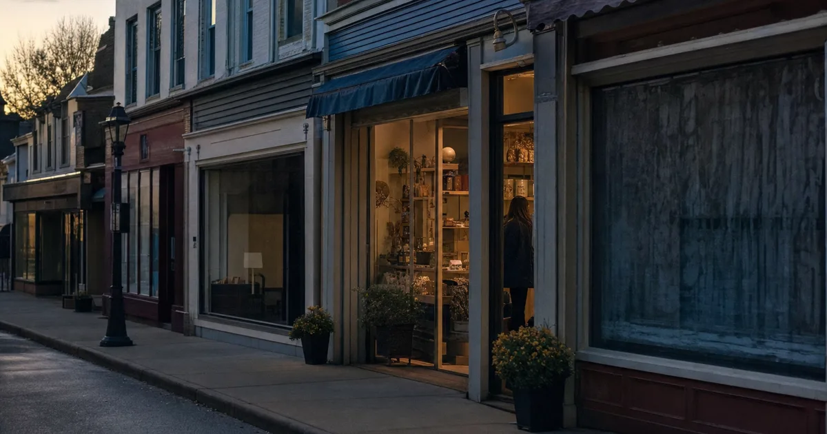
Picture a street with 100 shops. By rough estimates, that is what websites look like: about 85 are boarded up and nobody looks after them. About 14 have a beautiful shop window, but there is nothing to buy inside. And maybe one actually works and makes money.
These numbers are not precise statistics. They are a mirror. The question is which group your website belongs to.
The dead website: nobody is to blame, nobody is watching
A dead website is rarely bad from the start. It was built years ago and it worked. Then people changed, prices changed, and the site stayed the same. The phone number is old, the opening hours are from last season, the latest news is three years old.
Visitors do not know your business is doing fine. They only see a site nobody has touched and draw their own conclusion: “Are they even still around?”
Signs your website has fallen asleep
- The latest post or news item is more than a year old
- Prices or products no longer match reality
- On a phone the text is tiny and you have to pinch to zoom
- It loads slowly and shows a “Not secure” warning
- The contact form has never sent an enquiry, or nobody checks where they go
The shop window: looks good, sells nothing
The second group is trickier, because the owner is happy with it. The site is new, the photos are nice, everything is tidy. But all it says is “we exist”. Home, about us, services, contact - and that is it.
Someone who has decided to buy wants to do something: see a price, book a time, order, ask a question. If the only way is “call us”, some of them will close the page. Especially in the evening, which is exactly when many people search.
A website is not a brochure. It is the place where a customer can take the next step without waiting for someone to pick up the phone.
- Creative Idea
What makes the one working website different
The working website is not necessarily the most expensive or the most beautiful. The difference is that it is built around the question “what does the customer want to do here?”, not “what do we want to say about ourselves?”.
What a website that brings customers looks like
- Prices, or at least a guide like “from ... €”, so the customer does not have to guess
- One clear call to action on every page: order, book, request a quote
- Answers to the questions people ask on the phone every day
- Fast loading and easy to use on a phone, because that is where most visits come from
- Up-to-date information: opening hours, address, availability
- A reason to come back: a new product, a seasonal offer, a useful article
A 10-minute check
Open your website on your phone as if you were a stranger who found you on Google. Ask yourself three questions: Do I understand within 5 seconds what they offer? Can I see what it costs? Can I do something right now without calling?
If any answer is “no”, your site is probably in the second group. The good news is that turning a shop window into a working site usually does not need a new website, just a few changes in the right places. See also the most common website mistakes.
Where this idea comes from
This article expands one slide of our free guide “How to keep your business alive in 2027”. In plain language it covers depending on social media, the difference between a brochure and a working website, and how AI chooses which businesses to recommend. Read the guide - it is free, no sign-up.
If you want to see your website as a working one rather than a shop window, request a free mockup or estimate the price in a minute.